BOOK COVER DESIGNS
Exploring the Intersection of Storytelling and Visual Communication
Book cover designs based on different passages and poems.
Book Cover Design
Publication Design
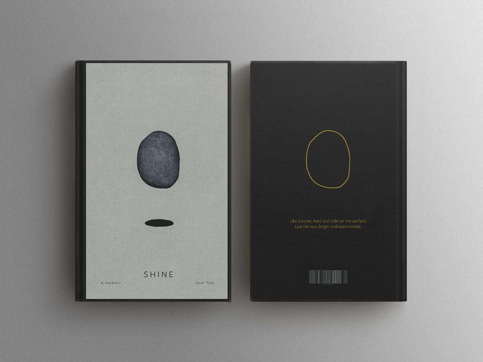
Shine
“Shine” is a book cover that is designed to represent myself.
If I were to describe myself, I would say I’m a stone. Stones are hard and stiff. You won’t really get a response when you poke it. This parallels my lack of response and reaction when people talk to me. I would usually just smile and nod. Or sometimes, I would just stare at them blankly if I don’t know how to respond. The stone is levitated off the ground. It reflects how I often have my head in the clouds and seem detached from reality. Stones often feel cold. The coldness of the stone and the grey colour throughout the cover reflects how people usually feel about me - cold and distant because I’m always reluctant to talk to new people. On the flip side, as shown by the sun imagery, when we get close, you would know that I goof around a lot, and am happy and warm in general. In which, my friends would often refer to me as the “child” in the group.
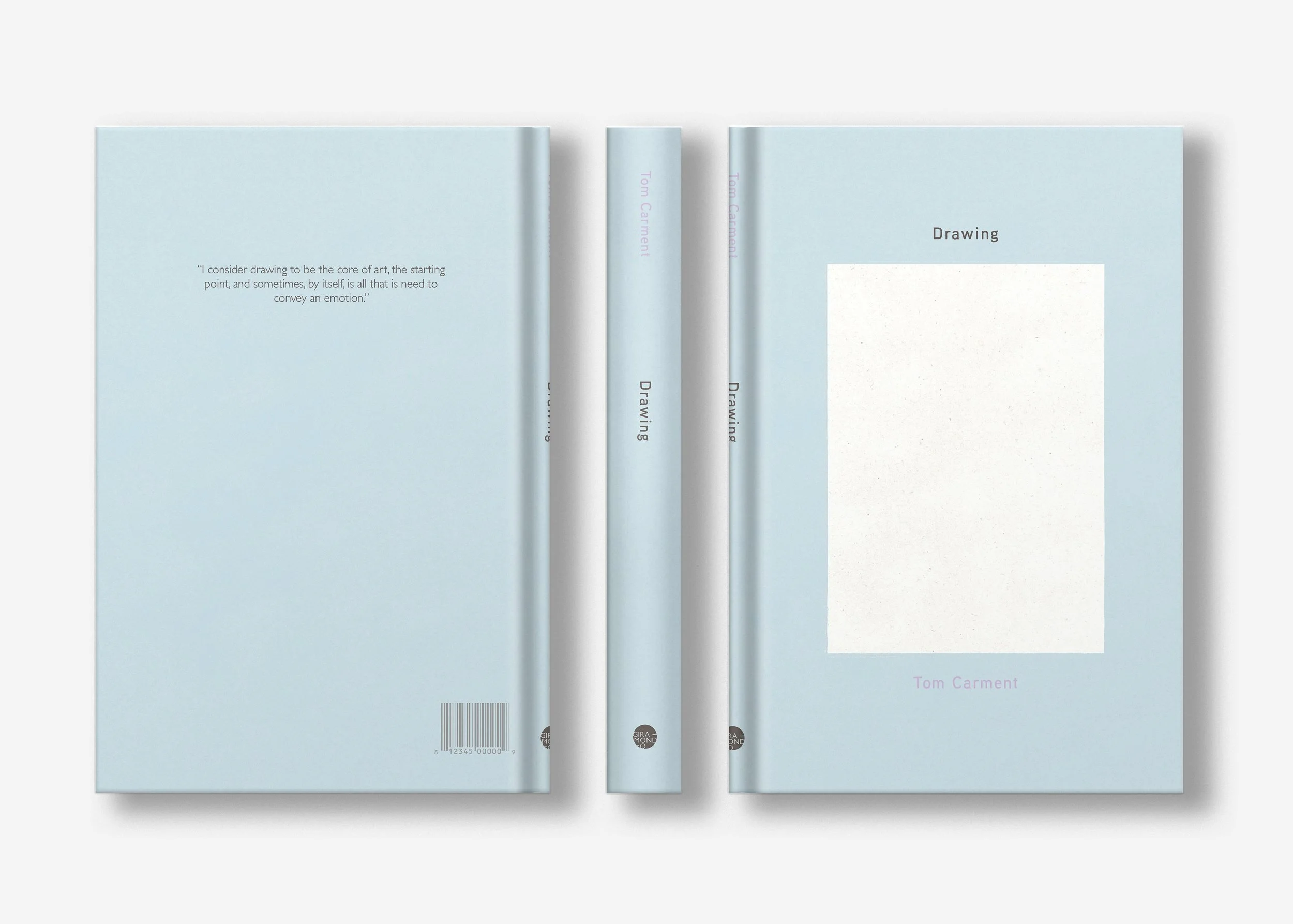
Drawing by Tom Carment
The blank piece of paper represents the limitlessness of drawing. Paper is an essential tool for drawing. As mentioned by Tom, it is what he always brings with him in his backpack, so that he can quickly record anything that catches his attention.
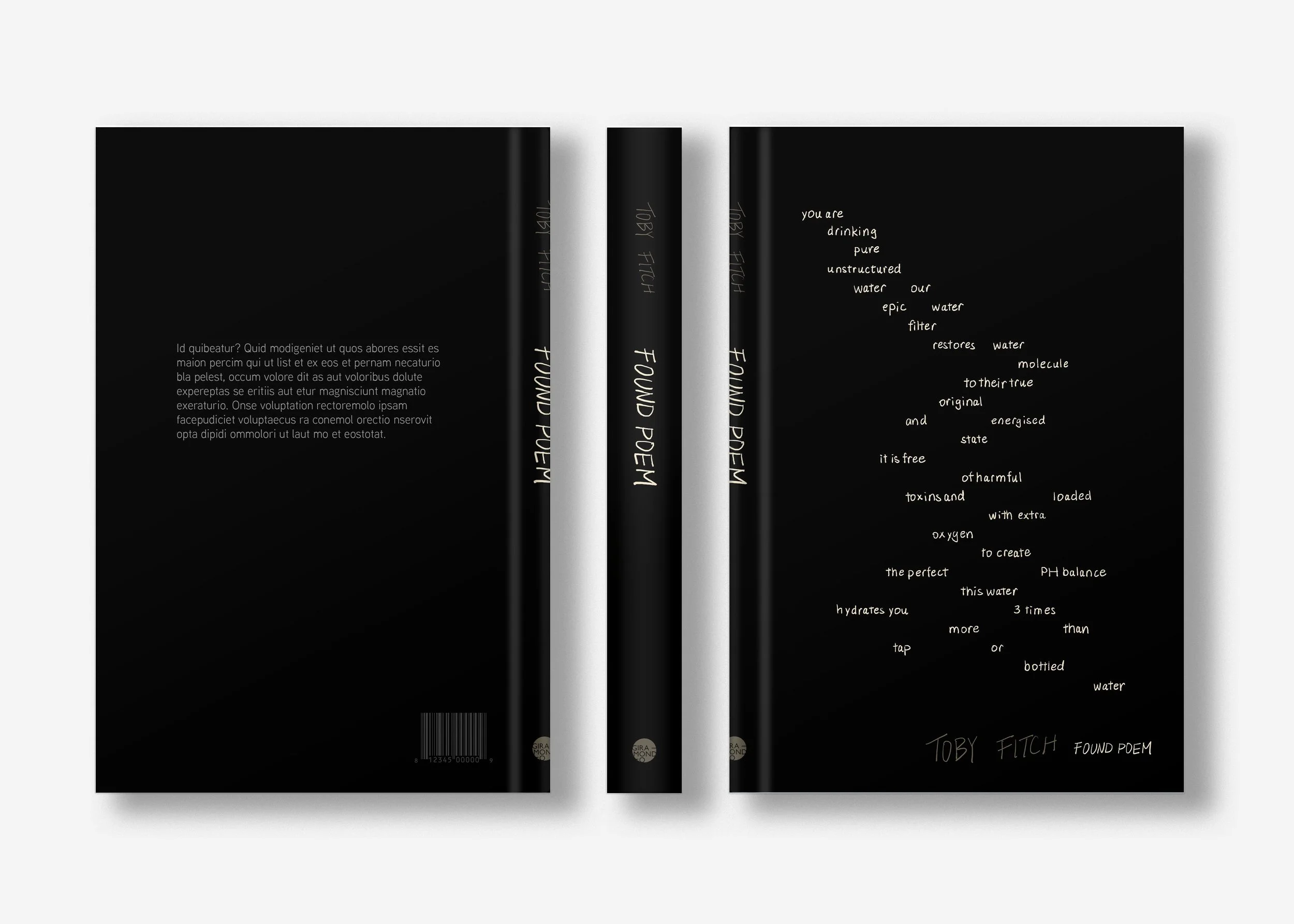
Found Poem by Toby Fitch
“Found Poem” is an unconventional, witty, and satirical poem by Toby Fitch, and it was selected and placed on the book cover to represent Toby’s ironic and sharp writing style. Black background, murky color, and hand written text are used to reflect the sarcastic tone of his work.
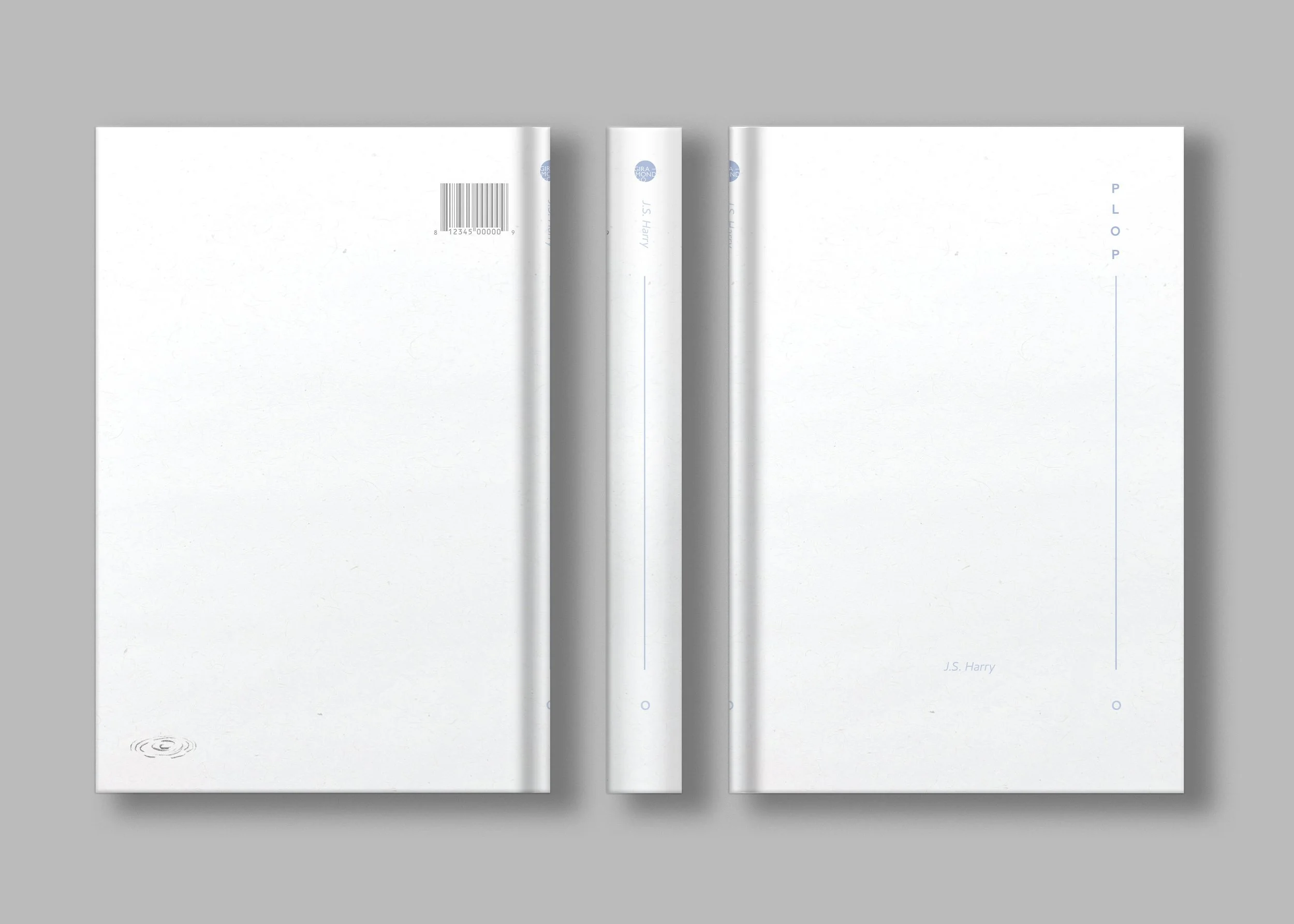
Plop! by J.S. Harry
The water drop on the cover and the water ripple on the back refers to the idea of presence and absence:
“over a backyard pool, carp slowly vanishing” “if humans were not infinite, how would the last one prove, for certain, she/he was the last?”
The vertical line and the small circle on the cover acts as the exclamation mark of the title “Plop”. The muted blue, minimal design, and generous white space on the cover creates a calm and quiet atmosphere. This corresponds to the overall soft and serene tone of the poem.